개인 프로젝트 레이아웃을 잡다가 Flex를 잘 쓰고 싶어서 인프런 강의를 수강하였다.
강의 들으면서 정리한 내용을 작성해보았다.
1. container에 display: flex; vs display: inline-flex;
<style>
		.flex-container {
			display: flex;
			/* display: inline-flex; */
		}
</style>
	...
<div class="flex-container">
		<div class="flex-item">AAAAAAAAAAAA</div>
		<div class="flex-item">BBB</div>
		<div class="flex-item">CCCCCCC</div>
</div>

<style>
		.flex-container {
			 display: inline-flex;
		}
</style>

2. responsive와 flex-item: 1
<style>
		.flex-container {
			display: flex;
			flex-direction: column;
		}
		/* 최소 600px은 되어야 실행되는 코드 (600px 이상)*/
		@media (min-width: 600px) {
			.flex-container {
				flex-direction: row;
			}
			/* 쓰인 만큼만 너비를 가져가지 않고 브라우저 너비 만큼 아이템들의 너비 늘어남 */
			.flex-item {
				flex: 1;
			}
		}
</style>
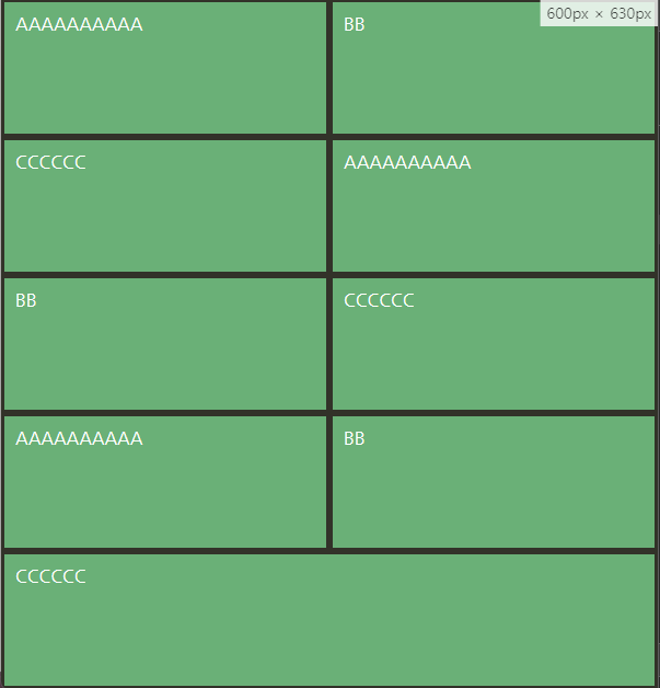
- 브라우저 너비 601px 일 때 flex-item에 flex:1

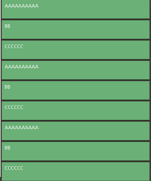
- 브라우저 너비 601px 일 때 flex-item에 flex:1 주석

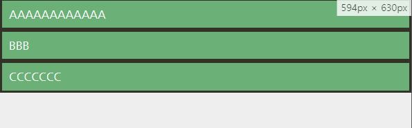
- 브라우저 너비 594px 일 때
3. align-items는 기본 값이 stretch
<style>
		.flex-container {
			display: flex;
			align-items: stretch;
			height: 300px;
		}
</style>

4. align-content는 wrap으로 넘어갔을 때, cross축 정렬을 어떻게 할 것인지 결정
5. flex-item에 적용하는 속성인 flex-grow는 남는 여백을 얼마 만큼의 비율로 가져갈 것인지 지정
<style>
		.flex-container {
			display: flex;
		}
		.flex-item {
			flex-grow: 1;
		}
		.flex-item:nth-child(2) {
			flex-grow: 3;
		}
</style>

6. flex-shrink를 쓰면 너비가 고정된 컬럼을 만들 수 있다
  <style>
      .flex-container {
          display: flex;
      }

      .flex-item:nth-child(1) {
          flex-shrink: 0;
          width: 100px;
      }

      .flex-item:nth-child(2) {
          flex-grow: 1;
      }
  </style>


7. flex = flex-grow(default: 0) + flex-shrink(default: 1) + flex-basis(default: 0)
- 아래 두 코드는 같은 동작을 한다.
<style>
		.flex-container {
			display: flex;
		}
		.flex-item:nth-child(1) {
			flex: 1;
		}
		.flex-item:nth-child(2) {
			flex: 3;
		}
		.flex-item:nth-child(3) {
			flex: 1;
		}
	</style>
<style>
		.flex-container {
			display: flex;
		}
		.flex-item:nth-child(1) {
			flex: 1 1 0;
		}
		.flex-item:nth-child(2) {
			flex: 3 1 0;
		}
		.flex-item:nth-child(3) {
			flex: 1 1 0;
		}
	</style>
flex-basis만큼 자리가 없을 때는 같은 비율로 보여지다가 여백이 생기기 시작하면 flex-grow를 따라서 늘어난다.
- width로 지정해주면
<style>
		.flex-container {
			display: flex;
		}
		.flex-item:nth-child(1) {
			width: 20%;
		}
		.flex-item:nth-child(2) {
			width: 60%;
		}
		.flex-item:nth-child(3) {
			width: 20%;
		}
</style>
여백이 없어도 width를 따라간다. 완전 고정 너비 컬럼을 만들 때에는 이런 식으로 작성
- flex-basis에 너비 비율을 주면 width랑 다르게 자리가 부족하면 너비가 줄어든다.
<style>
		.flex-container {
			display: flex;
		}
		.flex-item:nth-child(1) {
			flex: 0 1 20%;
		}
		.flex-item:nth-child(2) {
			flex: 0 1 60%;
		}
		.flex-item:nth-child(3) {
			flex: 0 1 20%;
		}
</style>
8. 유연한 플렉스 예제
wrap을 쓰고 width를 정해주고 flex-item에 flex 지정
<style>
		.flex-container {
			display: flex;
			flex-wrap: wrap;
		}
		.flex-item {
			flex: 1 1 auto;
		}
		.flex-item:nth-child(1) {
			width: 20%;
		}
		.flex-item:nth-child(2) {
			width: 60%;
		}
		.flex-item:nth-child(3) {
			width: 20%;
		}
</style>

- .flex-item { flex: 1 1 auto; } 주석

주석처리하면 flex 중 첫번째 요소인 flex-grow에 할당된 1이 0으로 되기 때문에 늘어나지 않는다.
9. 반응형 예제
<style>
		/*화면에 컬럼들이 꽉찼으면 좋겠을 때@! min-height를 100vh로 맞춰주어야 아이템들이 늘어날 자리가 있음 */
		/* min-height를 하면 넘치면 더 늘어남. 그냥 height로 하면 넘쳤을 때 안늘어남 */
		.flex-container {
			display: flex;
			flex-direction: column;
			min-height: 100vh;
			/* border: 10px solid red; */
		}
		.flex-item {
			flex: 1 auto;
		}
		@media (min-width: 600px) {
			.flex-container {
				flex-direction: row;
				flex-wrap: wrap;
			}
			.flex-item {
				width: 50%;
				/* flex-grow: 0; */
				/* flex: 0 auto; wrap으로 넘어간 애가 너비 다 차지하게 안하고 싶을때 */
				flex: 1 0 auto;
				/* flex-basis: 50%; */
			}
		}
		@media (min-width: 900px) {
			.flex-item {
				width: 30%;
			}
		}
</style>
- 브라우저 너비가 600px 보다 좁을 때, min-height: 100vh; 지정
- 브라우저 너비가 600px 보다 좁을 때, min-height: 100vh; 주석

min-height 대신 height를 쓰면 아이템들 높이 합이 height를 넘으면 container를 벗어날 수 있음
min-height를 쓰면 container의 height가 늘어난다.
- 브라우저 너비 600px 넘으면
- 브라우저 너비 900px 넘으면

10. align-self는 아이템 개별의 align 속성 지정, order는 아이템 순서 지정
11. auto margin
<style>
		.flex-container {
			display: flex;
			/* justify-content: space-between; */
			/* width: 600px; */
			/* margin: 0 auto; */
			/* margin-left: auto; */
		}
		.flex-item {
			width: 150px;
		}
		.flex-item:last-child {
			/* 남은 마진을 다 쓴다! */
			margin-left: auto;
		}
</style>

- flex-item:last-child { margin-left: auto; } 주석

11. footer만 맨 아래로 내리고 싶을 때
- flex-direction column으로 바꾸고 min-height 지정, content의 flex-grow 지정
<style>
		.page {
			display: flex;
			flex-direction: column;
			min-height: 100vh;
		}
		.content {
			flex: 1 auto;
			padding: 1.5rem;
		}
</style>

[참고]
인프런 강의 ( CSS Flex와 Grid 제대로 익히기) 중 flex 내용 기반으로 작성하였습니다.